According to Hostinger, web design influences 94% of first impressions. Amongst various aspects of web design, understanding how to use shapes in a web design plays a major role in designing different parts of visual art, giving the whole picture an alluring look. Going by the basics, shapes are an integral part of any geometric web design. They aren't just geometric eye candy. Shapes whisper secrets of emotion and meaning, organize chaos into clarity, direct your gaze like a seasoned tour guide, and waltz together to bring balance and harmony to any design.
Unfortunately, many do not understand how to use shapes in a web design. Due to their lack of knowledge and understanding of web design specifics, they do not know how these shapes can be used to create impactful layouts. Many have yet to learn the classification of these shapes into different categories. As a result, having such little information always creates difficulty in perceiving the design concepts. It is therefore important to first clear your basics and understand how many shapes are there in the web design book.
This blog will help you start right from the basics, giving a complete view how shapes are classified and used in different types of web design layouts.
Types of Shapes in Design
Before trying to pick a shape for your web design, it is important to know how many types are available for selection. Many beginners think that shapes are random and their layouts do not belong to any class. If you are also one of them having little knowledge about the shapes, time to dive in!
Geometric Shapes
Starting from the basics, the first category that is commonly known to everyone is the geometric shape. It is a category that defines those shapes that have been in our minds since childhood. From circles to rectangles and pentagons to hexagons, geometric shapes do not need any second introduction. We have been using these layouts in the drawing charts since kindergarten, hence they are easily identifiable.

Considering the design industry, the usage of these shapes is pretty common. Whether you are creating a banner or business brochure, geometric shapes are used in different forms throughout the visual. It is therefore important to have a clear understanding of them because they are commonly used everywhere.
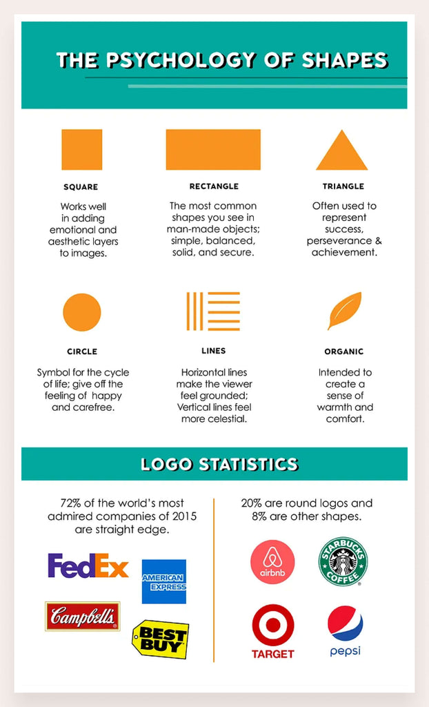
Geometric shapes in design carry a rich tapestry of meaning and functionality. Circles often evoke feelings of unity, eternity, and protection, symbolizing cycles and wholeness. Squares and rectangles represent stability, order, and reliability, commonly used to create a sense of balance and structure. Triangles, with their dynamic points and edges, suggest action, direction, and power, infusing designs with energy and movement.

A recent study by Adobe found that designs incorporating balanced geometric shapes saw a 23% increase in user engagement and a 15% improvement in user retention rates. This data highlights how the strategic use of shapes not only enhances aesthetic appeal but also significantly impacts user experience and interaction, making them an indispensable tool in the designer's toolkit.
By thoughtfully incorporating these shapes, designers can subtly guide viewers' emotions, organize information, and achieve a harmonious visual experience that resonates on both an aesthetic and psychological level.
Organic Shapes
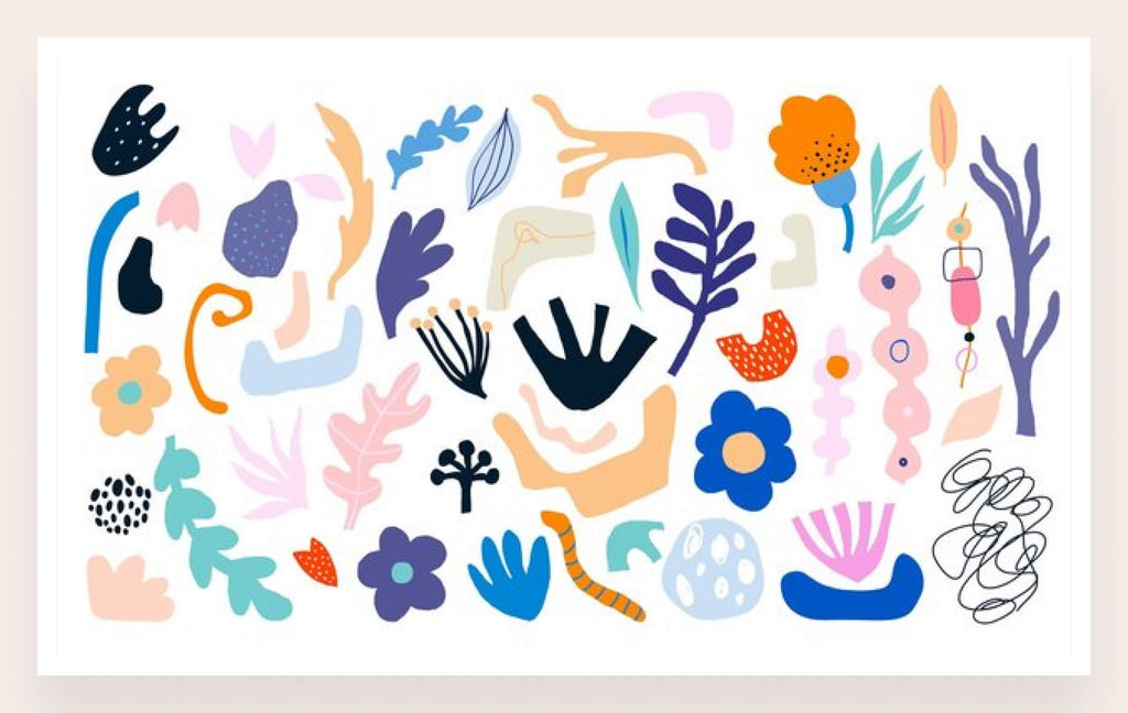
Next up, we have got a category that can be identified rightly by its name. The organic shapes represent those layouts that are constructed directly from the inspiration of nature, or any shapes that are irregular or asymmetrical and tend to have a curvy flow to them. It includes shapes like leaves, mountains, clouds, and more others that you could think of. They are usually used where you want to depict something relevant or related to nature.
While using organic shapes, you must choose colors wisely because 90% of first impressions are made through them. Since they are related to nature, you cannot explicitly use different colors that are not related to them. This could make your web design concept look weak, or totally inappropriate. So, try to choose the colors accordingly when using these shapes, as they look good when presented in an original style.
Organic shapes in design are characterized by their free-flowing, irregular, and asymmetrical forms, often inspired by nature. Unlike geometric shapes, which are precise and regular, organic shapes evoke a sense of naturalness, fluidity, and unpredictability. This design trend is gaining popularity due to its ability to create more relatable and human-centric visuals.
A survey by Adobe revealed that 66% of designers believe organic shapes would be a significant design trend, as they can make websites appear more approachable and less rigid. Incorporating organic shapes can enhance user experience by making designs feel more comfortable and engaging, encouraging users to explore content for longer periods.
Abstract Shapes
The third and most popular category used in web design is abstract shapes. The concept of these layouts is completely different from the above 2 categories. Abstract shapes are not inspired by anything, yet they look the most creative of all. From branding to web design, people love to use abstract shapes to bring creativity to the design. They can be used at various places depending on how you want to show uniqueness in the web design.

Nowadays, abstract shapes are commonly used in website designs. It is a relatively new-age shape that helps to illustrate diversity in a website layout. Those businesses that love to rebrand their sites regularly, prefer to use them with different types of website redesign ideas.
Abstract shapes in web design serve as powerful visual elements that evoke creativity, imagination, and uniqueness. Unlike geometric or organic shapes, abstract shapes do not represent tangible objects but rather provoke emotional responses and convey brand personality. They are effective in breaking away from traditional design norms and capturing attention.
How to Use Shapes in a Geometric Website Design
Many people often do not know how to use shapes in a geometric web design. It generally requires a proper planning that is usually not known to the beginners.
If you are also facing similar types of problems while using shapes in a web design, follow the tips given below. It will let you understand which points should be kept in mind while using any shape on the front of the website interface.
Maintain the Balance

Source: prerit
A perfect web design requires a stellar collaboration of all the elements used in the art. This is called maintaining balance, and it is considered highly important while using shapes in geometric website designs.
From colors to sizes, a geometric shape should have everything balanced in a correct manner. By aligning everything perfectly, you ensure to give a unified message through the visuals of a web design.
Achieving balance involves employing symmetrical or asymmetrical layouts effectively, depending on the design goals and brand identity. Regular user testing and feedback collection are essential practices to maintain balance, as they provide insights into how users interact with and perceive the website's visual hierarchy and organization.

A lot of times, beginners do not pay attention to the balancing part of web design elements. They use shapes without forming any alliance between the components, which then results in projecting a bad overall image. So, keep in mind to strike a balance while blending shapes in a web design, as a collaboration between all the components should always look evident in the layout.
Use Symmetrical Compositions
Another thing you should keep in mind while using geometric shapes is the maintenance of symmetrical compositions. It refers to a method with which you bring a fine rhythmic flow of elements within the web design. This includes shapes, font styles, and other components that are used in the web layout. By maintaining perfect symmetry, you ensure to produce a web design that is visually appealing.

Symmetrical compositions in web design offer several benefits, including a sense of order, harmony, and visual balance that can enhance user experience. By mirroring elements evenly around a central axis or focal point, symmetrical layouts convey a sense of stability and professionalism, making it easier for users to navigate and understand content.
To effectively use symmetrical compositions, designers should start by identifying the central axis or focal point of the layout and ensure that elements are evenly distributed on either side. This approach helps create a cohesive and organized visual hierarchy, improving usability and guiding users through the content seamlessly.
Whether you are working with isometric triangles or showcasing a blend of patterns, a symmetrical composition always provides a fine unified display. It showcases an organized design approach, giving your website UI a decent look.
Understand Color Psychology

Having a good understanding of color psychology is considered important because 80% of brand recognition depends on the colors. It lets you understand which colors are more suitable for a web design when seen in relation to the background. The same theory applies to the designing of shapes, as you need to pick those colors that look more coherent with the concept of the shape. For instance, warm colors like red and orange can evoke feelings of energy and excitement, while cooler tones like blue and green promote calmness and trust.
To effectively apply color psychology, designers should first consider the brand's identity and target audience. Choosing a color scheme that aligns with the brand's values and resonates with the audience can strengthen brand identity and improve user experience. Utilizing tools such as color palettes and contrast ratios helps in selecting complementary colors that enhance readability and visual appeal.
For instance, if you are using organic shapes, then the selection of colors should be done according to their natural concept. In the case of abstract shapes, you have got multiple options to go with. Ideally, these shapes require a color combination that looks good to the eye. Keeping this in view, you can select any color that presents an appealing look, provided it also aligns with the overall theme of the website UI.
Inspirational Examples of Geometry in Web Design
Mokhtar Saghafi

Mokhtar Saghafi is a UI/UX designer who knows how to play with shapes and colors in a web design. The website of Mokhtar defines this fact quite evidently. It is one of those rare web designs that has perfectly used Rhombus shape in different layers. Looking at it closely, you will notice the initials of the designer being highlighted in the center of the layout. That has been done quite smartly, making the website look aesthetically creative.
Case 3D

Case 3D presents a perfect example how simple geometric shapes like triangles can be used in a web design. This website is related to the real estate and architecture industry, hence the usage of symmetrical shapes becomes understandable in it. The overall layout of the website is pretty clean, as the designers have tried to highlight the spotless usage of geometrical elements in the design. It is certainly a good example for those who want to know how shapes like triangles can also be used in the center of any web interface.
Built by Buffalo

Built by Buffalo is a design agency that focuses on bringing creativity to UI/UX designs. By looking at the landing page, you can quickly notice the cleanliness of the overall layout. Apart from that, the usage of geometric shapes like hexagons and circles showcases the vision of highlighting simplicity in the design. Being a beginner, you can learn a lot from this website, and devise your own strategies centered around using geometric shapes.
Final Words
That brings us to the end of this blog in which we have discussed how geometric shapes can be used in website layouts. It is an important topic that should be understood properly because many beginners often commit mistakes while using shapes in web design. Their lack of knowledge often becomes a major factor in making these mistakes, which is why a detailed understanding of the process is required.
This blog is therefore written to let them understand how shapes should be properly used in a website layout. It has also defined different classifications of shapes so that everyone can understand how shapes are divided into various categories. It will certainly help all the beginners who are unable to understand the usage criteria of different shapes, provided they’ve got a good grip on the basics of web design.