The success of any eCommerce business starts with having a user-friendly and fully functional website or online shop. It's where customers can browse products, fill their virtual shopping carts, input shipping and payment details, and complete purchases.
However, some people abandon their carts at the last minute because they primarily don't want to purchase on the first visit. Others want to compare product and shipping prices, buy in-store, explore other payment options, and find another online shop with fewer technical issues. As such, giving them a seamless user experience on your website becomes an imperative.
Read below to learn how to make your website more user-friendly and boost your online shop's conversions.
Understanding Cart Abandonment

Image source: Pexels
Before moving forward, understanding what cart abandonment is and its impacts can help you address the issue and optimize your website effectively.
Cart abandonment occurs when a potential customer selects and adds products to their virtual cart but abandons the ship before completing the transaction. It can have several implications, such as:
1. Lost revenue
According to Dynamic Yield, companies lose $18 billion in sales revenue each year from cart abandonment. This effect is a stark reminder that eCommerce success is not just about the number of visitors or the allure of products; it's about turning prospects into paying customers.
2. Reduced conversion rate
Cart abandonment chips away at the conversion rate—a metric important in evaluating an eCommerce business's success. As more prospects abandon their carts, the percentage of successful conversions dwindles.
Some companies send cart abandonment emails to avoid this problem. For instance, hair health company Traya added shopping carts directly in their cart recovery emails and achieved a 15% cart recovery rate. Meanwhile, 4.8% of its users placed orders.
3. Marketing effort inefficiency
Efforts and resources invested in marketing campaigns, user experience enhancement, and product offerings lose effectiveness when customers abandon their carts. This impact highlights the need to bridge the gap between drawing customers in and seeing them through checkout.
4. Increased acquisition costs
The customer acquisition cost is high, especially in competitive markets. Abandoned carts amplify the effective cost of acquiring each successful conversion, affecting the overall return on investment.
5. Customer engagement challenges
An abandoned cart can indicate potential issues in the overall shopping experience – from usability concerns to pricing perception.A 2023 Baymard Institute study found that 25% of consumers abandoned their carts because the site did not have a guest checkout option. Meanwhile, another 17% cannot see or calculate their total order cost upfront.
Businesses should revisit their strategies and identify areas for improvement. Doing so allows them to increase conversion rates by 35% through checkout design enhancements alone.
6. Data insights for improvement
Each abandoned cart presents a treasure trove of insights into user behavior. For instance, the same Baymard study found that 18% of consumers abandon their online carts because the checkout process is too long or complicated.
Addressing pain points in the customer journey can enhance the user experience and drive completion rates.
The Role of Checkout Process Optimization

Image source: Pixabay
The checkout process is where conversions are either sealed or shattered. As such, you must optimize this pivotal phase to prevent cart abandonment and increase conversion rates. Here's how a streamlined checkout process wields its transformative power.
1. Combating cart abandonment
An optimized checkout process addresses the pain points that often drive customers away. Ensuring simplicity, clarity, and efficiency minimizes friction and eases the journey from cart to completion. When you create a hassle-free checkout process, customers are less likely to abandon their carts out of frustration or confusion.
2. Amplifying conversions
The synergy between an optimized checkout process and enhanced conversions is undeniable. Customers who encounter a smooth and effortless transaction experience are more inclined to complete their purchases and buy from your business again.
3. Fostering trust and confidence
A well-optimized checkout process establishes trust in an online shop. Elements like a notice for accepted payment options and a transparent order summary with a visible security badge can help you foster customer confidence. Adding these components can also address data security and transaction authenticity concerns.
4. Minimizing distractions
A clean and uncluttered checkout page guides customers' attention solely to the transaction process. Minimized distractions reduce the chances of customers veering off course and abandoning their carts due to unrelated offers or promotions.
5. Creating a user-centric approach
An optimized checkout process is a testament to a user-centric approach. It acknowledges that customers seek swift, seamless interactions. With a user-centric checkout process, you show that you respect customers' time and effort—leaving a positive impression beyond the transaction itself.
The Synergy of Design and Experience
When it comes to online shops, a smooth web design is one of the most significant factors that creates a seamless checkout process. In fact, 94% of users form first impressions of a brand based on its website, while another 75% judge an online page's credibility based on its overall design.
A smooth web design ensures consistent visual elements, intuitive navigation, and responsive layouts. Additionally, a seamless design transition from the browsing to the checkout phase preserves user familiarity, reducing the risk of abandonment due to confusion or disorientation.
Moreover, an organized web design eliminates clutter that may deter customers during the final transaction. Distinct and easy-to-find calls to action (CTAs) and logical flow prevent them from feeling lost while encouraging them to move forward confidently.
Take the Singapore-based brand Beyond the Vines as an example. Its web design features only a few color accents and clear CTA buttons. When you head to checkout, it offers to gift wrap your order, write a message if you plan to give an item to someone else and make other special requests. It also clearly organizes the fields you must fill to complete your order.

Image source: Beyond the Vines
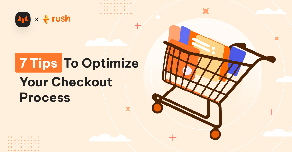
7 Tips for Optimizing the Checkout Process

Image source: Pexels
Optimizing the checkout process can be challenging and time-consuming. However, knowing the right tips can help ensure your eCommerce website creates a seamless shopping experience for new and existing customers.
1. Enhance user interface
A seamless checkout hinges on a user-friendly and straightforward interface. Consider showing clear CTA buttons that lead customers effortlessly through the process. Remove distractions that may divert attention and encourage straightforward navigation from cart to completion.
Moreover, consider adopting an accordion checkout option like Nike. It involves using collapsible panels to organize the different steps of the checkout process. This approach makes checking out more streamlined and less overwhelming. It also creates a more modern and organized look, making your website look visually pleasing.

2. Optimize for mobile
With an estimated 6.84 billion mobile users worldwide, optimizing your e-commerce website for smartphones and tablets is now more crucial than ever. So, employ a responsive web design that ensures your online shop adapts seamlessly to different screen sizes.
Place critical interactive elements, such as buttons and menus, within easy reach of users' thumbs. Doing so considers how they naturally hold and interact with their mobile devices. You can also choose legible fonts and their sizes that are comfortable to read on smaller screens without users having to zoom in.
Also, simplify the checkout process for mobile users by minimizing the number of steps and form fields required for completion.
3. Offer a guest checkout option
Some people simply don't want nor have the time to create an account to purchase an item. A 2022 survey found that 66.7% of customers expect checkout to be four minutes or less. Meanwhile, 28% expect it to happen in just two minutes.
In that regard, offer a guest checkout option to speed up the shopping experience for new customers. Place this option prominently on the checkout page, ideally near the login or registration area. Use clear labels such as "Continue as Guest" or "Checkout as Guest" to make it easily recognizable.
Also, request only the necessary information. For example, consider providing a checkbox for using the same billing address as the shipping address to reduce added data entry.
4. Show progress
Showing progress for the checkout process can significantly enhance the customer journey. They visually guide users through the steps required to complete a purchase. It also provides a clear sense of their progress and prevents them from abandoning their carts due to frustration.
Identify the key steps involved in your checkout process, such as "Cart," "Shipping," "Payment," and "Review." Break down the process into logical stages that customers need to complete.
You can also assign visual icons or symbols to each step for easier stage identification. For instance, you can include a cart icon for the cart step and a shipping truck for the shipping one.
Take the headphone and earphone brand Skullcandy as an example. It gives customers a simple preview of the whole checkout process so they know what to expect. The brand follows the Keep it Simple, Stupid (KISS) principle to avoid confusion, impatience, or frustration.
5. Display trust signals
Incorporate trust signals, like security badges, SSL certificates, and recognized payment options to address data security and payment authenticity concerns. Past studies have shown that trust seals help a brand appear more credible to 75% of customers. Moreover, 61% do not complete a transaction if a website lacks trust marks.
Cybersecurity attacks and data breaches are becoming increasingly sophisticated in today's digital world. Showing your website's security assures customers they can confidently order from your online store.
6. Provide clear error messages and help resources
Checkout errors can be a major roadblock in the overall customer experience. As such, craft error messages that precisely describe the issue. Avoid generic messages like "Error occurred;" instead, provide specifics, such as "Invalid email format."

Image source: CreativeMarket
For other customer concerns, provide a comprehensive FAQ or knowledge base section addressing common user queries. Research shows that 90% of customers worldwide want brands or organizations to have an online self-service customer support portal.
Organize your FAQs logically with clear categories and a search function. You can also offer real-time chat support with knowledgeable agents who can assist users, especially during checkout. Gather user feedback on areas where help resources are most needed. Then, regularly test and refine these resources based on user interactions.
7. Optimize loading speed
According to nearly 70% of consumers, a website's loading speed influences their purchasing decisions. This number is due to the fast-paced environment in which we live, where waiting in a queue for only a few minutes can be tedious. Customers feel more annoyed when a page loads slowly, and they truly need or want something quick.
That said, optimize the checkout process for speed and minimal loading times. You can use Content Delivery Networks (CDNs) to distribute your website's content to servers in different geographic regions. This way, you can reduce the distance between users and your server and speed up loading times.
You can also reduce the number of images, scripts, stylesheets, and other elements on a page to decrease the number of HTTP requests needed to load content. Moreover, use Google's AMP framework to create lightweight, fast-loading versions of your pages for mobile users.
Optimize for Success

A seamless checkout process bridges prospects and conversion by reducing cart abandonment. However, optimizing the checkout process can be a challenging task. Luckily, several tips can help you - and understanding the synergy between the checkout process and a smooth web design can make the task more effective.
As visitors transition seamlessly from browsing to checkout, their confidence soars, their hesitations fade, and the path to purchase becomes a joyful expedition.